
So I thought that this post should be an educational one, informing you about all the aspects I’ve learned about colour. You might already know all this or maybe you are like me, relying on your instincts and intuitively knowing what colour combinations work and which don’t. In this case it might just refresh your knowledge or give you some background to your intuitive choices.
Colour is one of the most powerful elements, not to say THE most important element in interior design. It can create or break a look and knowing how to use colour is a powerful tool. To handle this tool accurately you should always make sure you know the reasons behind your colour choices. This ensures that you achieve exactly what you’re aiming for.
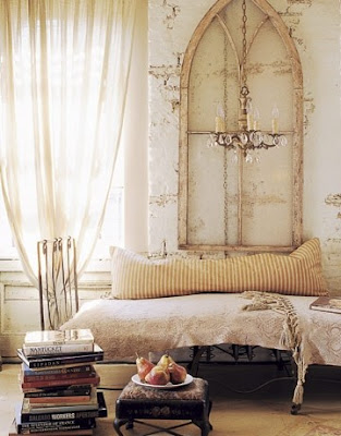
Knowing how to use colour means knowing how to be in control of structure, shape, space, balance, proportion, pattern, harmony and repetition. These are some of the most important elements of interior design and are essential if you want to create a beautiful room. Even if you are, like me, into white rooms, you will need to know the properties of colour as even a white room needs colour.

(image: Atlanta Bartlett)
Let’s start with the basics: What we perceive as colour are the wavelengths of the light spectrum that are reflected by surfaces.
What’s important is that except at midday the light does never contain the entire colour spectrum. That means the way colour is reflected changes in the course of the day.
That’s why it’s so important to first paint only a small patch of your wall and observe it in different daylights as your chosen colour might look brilliant in the morning but very dull towards the evening. This is because whatever colour is lacking from the spectrum of the light can’t be reflected by this light. In other words redish light, as it appears toward the end of the day, will only reflect the warm parts of the colour spectrum and neutralize the cold colours so they appear dull and vice versa.
Colour schemes:
When it comes to creating colour schemes it’s useful to know that there are two main approaches. Combining related colours creates a harmonious scheme, whereas a contrasting colour scheme creates energy in the room. To know what colours are related and what colours are complementing each other you need to have an understanding of the colour wheel.

All colours are created by primary colours, which are red, yellow and blue.
These are called primary colours as they themselves can not be mixed from other colours.
Mixing primary colours to equal parts will create secondary colours, which are orange, green and violet.
Mixing these in turn creates tertiary colours. These are red-orange, yellow-orange, yellow-green, blue-green, blue-violet, red-violet.
Ok, if you’re thinking that it’s getting a bit boring now, hold on, let’s look at some more practical aspects to the colour wheel.
As you can see, all warm colours can be found on the right side of the wheel. These are the red, orange, yellow colours. Warm colours come forward and make a room feel more intimate and cosier.

(image: verhext)
Cold colours can be found on the left side of the wheel. These are green, blue and violet colours. Cool colours recede and can therefore open up a space and make it appear more spacious.


(images: Ideal Home)
Colours lying opposite each other are complementary colours. For example, red and green. These colours go very well together and can often be found in nature as well.

They complement each other as the second colour will absorb all colours in the light spectrum that the first doesn’t.
Adjacent colours are colour that are lying directly next to each other or very near each other. They go together as well as they are related to each other.

So coming back to our starting point, when you create a colour scheme you can either choose a harmonious or a complementing scheme.
In a harmonious colour scheme you will use colours that are related to each other. That means these colours lie next or at least very close to each other on the colour wheel. Another option to create a balanced design is by sticking to one colour but using different tones throughout the room. This is also referred to as monochromatic scheme. It’s simple but effective.

To create an energetic or dramatic design you would go for a complementary colour scheme, which consists of contrasting colours, so colours that lie opposite each other on the colour wheel. It is important though to get the proportion right. If you use both colours to equal parts, the room will feel too busy as the eye will be bouncing around with nowhere to rest. Choose one colour as the main colour and use the other for accents only.

If you are familiar with the properties of colour you can manipulate a space by making it appear larger or smaller, you can correct proportions in a room, create balance and rhythm and you can create certain moods and feelings.
Obviously there is much more you could say about colour but let's be honest, it's more exciting to actually do it than talking about it!
Are there any great colour combinations you've come across recently? Let me know!
Speak to you soon.
Nadine
Colour is one of the most powerful elements, not to say THE most important element in interior design. It can create or break a look and knowing how to use colour is a powerful tool. To handle this tool accurately you should always make sure you know the reasons behind your colour choices. This ensures that you achieve exactly what you’re aiming for.
Knowing how to use colour means knowing how to be in control of structure, shape, space, balance, proportion, pattern, harmony and repetition. These are some of the most important elements of interior design and are essential if you want to create a beautiful room. Even if you are, like me, into white rooms, you will need to know the properties of colour as even a white room needs colour.

(image: Atlanta Bartlett)
Let’s start with the basics: What we perceive as colour are the wavelengths of the light spectrum that are reflected by surfaces.
What’s important is that except at midday the light does never contain the entire colour spectrum. That means the way colour is reflected changes in the course of the day.
That’s why it’s so important to first paint only a small patch of your wall and observe it in different daylights as your chosen colour might look brilliant in the morning but very dull towards the evening. This is because whatever colour is lacking from the spectrum of the light can’t be reflected by this light. In other words redish light, as it appears toward the end of the day, will only reflect the warm parts of the colour spectrum and neutralize the cold colours so they appear dull and vice versa.
Colour schemes:
When it comes to creating colour schemes it’s useful to know that there are two main approaches. Combining related colours creates a harmonious scheme, whereas a contrasting colour scheme creates energy in the room. To know what colours are related and what colours are complementing each other you need to have an understanding of the colour wheel.

All colours are created by primary colours, which are red, yellow and blue.
These are called primary colours as they themselves can not be mixed from other colours.
Mixing primary colours to equal parts will create secondary colours, which are orange, green and violet.
Mixing these in turn creates tertiary colours. These are red-orange, yellow-orange, yellow-green, blue-green, blue-violet, red-violet.
Ok, if you’re thinking that it’s getting a bit boring now, hold on, let’s look at some more practical aspects to the colour wheel.
As you can see, all warm colours can be found on the right side of the wheel. These are the red, orange, yellow colours. Warm colours come forward and make a room feel more intimate and cosier.

(image: verhext)
Cold colours can be found on the left side of the wheel. These are green, blue and violet colours. Cool colours recede and can therefore open up a space and make it appear more spacious.


(images: Ideal Home)
Colours lying opposite each other are complementary colours. For example, red and green. These colours go very well together and can often be found in nature as well.

They complement each other as the second colour will absorb all colours in the light spectrum that the first doesn’t.
Adjacent colours are colour that are lying directly next to each other or very near each other. They go together as well as they are related to each other.

So coming back to our starting point, when you create a colour scheme you can either choose a harmonious or a complementing scheme.
In a harmonious colour scheme you will use colours that are related to each other. That means these colours lie next or at least very close to each other on the colour wheel. Another option to create a balanced design is by sticking to one colour but using different tones throughout the room. This is also referred to as monochromatic scheme. It’s simple but effective.


To create an energetic or dramatic design you would go for a complementary colour scheme, which consists of contrasting colours, so colours that lie opposite each other on the colour wheel. It is important though to get the proportion right. If you use both colours to equal parts, the room will feel too busy as the eye will be bouncing around with nowhere to rest. Choose one colour as the main colour and use the other for accents only.

If you are familiar with the properties of colour you can manipulate a space by making it appear larger or smaller, you can correct proportions in a room, create balance and rhythm and you can create certain moods and feelings.
Obviously there is much more you could say about colour but let's be honest, it's more exciting to actually do it than talking about it!
Are there any great colour combinations you've come across recently? Let me know!
Speak to you soon.
Nadine
I really enjoy your blog. So much talk of interior design! I hope you don't mind if I follow your entries?
ReplyDeletelove your musings on "color". any chance you have an insight for someone addicted to restoration hardwares, "silver sage". as friends point out time and again, "it is my signature color"! beautiful photos!
ReplyDeleteHi both,
ReplyDeleteThanks a lot for your comments.
Danette - I love restoring stuff as well. Getting those creative juices flowing is just great. Are you working on something at the moment?